


Untitled (041A7859), 2024
mixed-media assemblage
29.7 x 42.0 cm
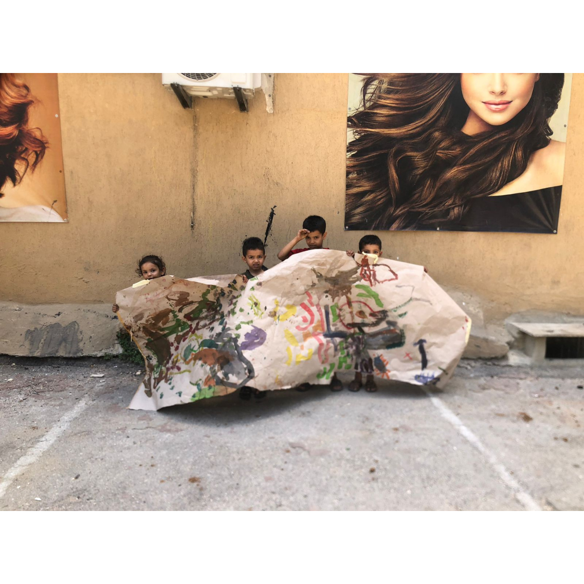
Omar was seven when he made the work, and Streetcolors as an organisation started with him. Born in Lebanon to a Syrian refugee family, he was living with his family of five in a very small room next to a parking lot. He was the first to interact whenever Karine Wehbé, the founder of Streetcolors, used to go there. He was always playing, energetic, and a dynamic kid.
When Wehbé did her first activities, trying out painting with him and the other children, Omar would come to her afterwards and ask when she would come back, and when she would start a school for him and his friends. She said he is the reason why Streetcolors officially came to be. He liked the other children and would encourage them to participate.
Later, he left for Syria with his family, even though he didn't want to leave. But he returned a few days later having fled alone from Damascus and crossed over the border and landed at the exact location his family had stayed at.
Medium: mixed-media assemblage
Frame: unframed
Ships from the United Kingdom
Couldn't load pickup availability


Close considerations
Omar’s artwork is a mixed-media assemblage on paper combining broad painterly fields of red and blue, brushed and scrubbed with objects. A loose black drawing in the upper centre-right with linear graphic marks on the left. Attached objects include a pale green strip, a black corrugated rectangle, and a small gold disc with a folded bottom. And it is overlayed with a delicate thin green strand arcing across the lower half, tacked down with bits of white tape and a small cutout.
An organising device is the horizontal red patterned tape band running across the plane, which acts like a horizon line forming a seam between the two predominant colour fields. The structure of this painting has the language of the landscape of sky and ground while being fully abstract.
The upper field of blue smears and some white scumbles suggests moody sky or water, and a sense of speed, while the red in the middle of this part feels like an underpainting pushing forward.
The lower field is dense and earthier with darker stamps/blocks, vertical marks and the delicate green arc that adds contour, and suggesting gravity and time through the sequence of the linear marks.
The palette of red versus/and blue evokes the dynamic of heat/cool, body/mind, earth/air, intensity/calm. Here, the blue is streaky like stormy sky or restless ocean portending something ominous and enveloping, while the red is grounded enough to carry the delicate arc which is like a stem or even a scar.
The sketchy black drawing hovering in the upper field, centre-right is of a simplified object, what seems like a tool of some sort like a handle, introducing a reference to the everyday objects, along with the textless, censoring administrative label-like pale green strip and the industrial, tactile corrugated black cardboard rectangle cutout, which also contains a drawing that is an outline of something resembling a flag attached to a pole. The use of and reference to things referring to daily life places the work within an urban contemporary context, which makes it both comforting because it relates to us and the things we use but also threatening because it is rendered within abstract painted fields with ambiguous implications.
The gold circle is a special element that offers an anchor symbolising the sun or moon or coin or icon, a promise of order in a gritty world, a possibility of transcendence.
This is a composition that balances asymmetries with counterweights, a textured rhythm, ambiguous scale as the landscape like painting is punctuated with collage pieces of everyday objects juxtaposing the macro land with the micro things, the latter seeming to hold the elements together, holding down the force of nature. It can be read as the story, or description of a particular place and the mood there. Perhaps his home or playground or where he would like to be given his psychologically traumatic sense of home.


Process
This ink and paint on paper work is made in the same way as most children's at Streetcolors Beirut; sat down, bent over, and standing over the work and through several sessions, and developing styles that are their own with specific sets of forms, colours of interest, and patterns distinguishing them from one another.
They are supported by the volunteers who help them handle their tools and prevent them from creating a violent mess. Children who started making artwork with them have found a balance in their mental states. Those who started out frozen and unable to speak found the ability to expand their scope and began making friends; and those who started out extremely violent and aggressive became more settled over time.


Visual echoes
This style of here is redolent of Cy Twombly’s and Jean-Michel Basquait’s graffiti gestures and diagrammatic mark-making, where the construction is not aiming for an illusionist effect but refers to the thinking and creating of itself plainly.
And the assemblage of matter extracted from the world on the painting base makes the artwork oscillate between image and artefact, breaking the illusionistic effect that a painting risks becoming a window into something and elsewhere, anywhere but here. This aspect of assemblage links to Kurt Schwitters’s use of scraps and Robert Rauschenberg’scombines, where painting and objects sit together, raising the question about the artwork as a painted scene or a construction, both.
And while the Arte Povera movement’s artists tried to be scrappy, refusing polish, they remained in a bougeious context of choices being made to a certain extent in reaction to the capitalist progress of Italy, exhibiting in capitalistic art galleries and establishment museums. This artwork by Omar, of a child refugee whose entire living memory has been destruction and instability and transience of the notion of home, on the other hand is a reality reflected in the simple geometric inserts, being minimalistic in a non-minimalistic painted scene, rejecting the purity of flatness, making its creation a more authentic and urgent undertaking within the context of war.